
Lines can be a powerful tool in your design arsenal, but with great power comes great responsibility. Understanding what lines signify can help you avoid the following mistakes:
Line Mistake #1:
Putting a line under a headline
Lines signify separation, so putting a line under a headline signifies to the viewer that the headline is separate from any content that follows. Not cool if your headline actually goes with the content below it. Instead of putting a line under a headline, use carefully considered negative space instead.
Line Mistake #2:
Underlining text that is not linked
In our internet-based culture, we’ve come to associate underlined text with hyperlinks. Therefore, you should only underline text that is actually a link. Underlining text merely for emphasis will confuse the viewer and could lead them to believe your content’s functionality is broken.
Line Mistake #3:
Using lines haphazardly as design elements
Lines should not be used merely for filler to balance your design. Remember, lines have significance, and viewers are looking for meaning in your design. If you find yourself putting a line in your design without a reason you can easily articulate, consider finding another solution instead. Consider using pattern, illustration, or rearranging your content altogether.
Line Mistake #4:
Putting heavy lines behind your data
Lines clutter. Heavy lines in charts, graphs, and tables only serve to obscure data. Remember, we visualize data to be able to get those “aha!” moments that are not apparent from looking at numbers alone. So get those heavy lines out of the way and let your data shine.
Article directory:
3 Simple Ways to Edit PDFs
Take charge of your files without having to bother your designer
Read more >
4 Common Mistakes When Using Line in Design
Lines have meaning. Use them correctly or look like a buffoon.
Watch Video >
5 Quick Tips for Using the Pen Tool
Nobody likes the pen tool on the first ten tries. These tips will make using it less painful.
Watch Video >
Your own POPs and PODs
Create your personal design brand using marketing principles.
Read more >
What I tell students when they say they want to freelance
Spoiler Alert: I usually try to talk them out of it.
Read more >
What I miss about Web design of the '90s
Web design has come a long way since the last century, for better or for worse.
Read more >
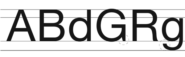
Semiotics in typography
There is a reason the shape of a serif makes you feel that way.
Read more >
An introduction to Gestalt principles
Know what it's really all about.
Read more >

To barter or not to barter
Here are some general guidelines to follow to ensure relationships emerge unscathed.
Read more >
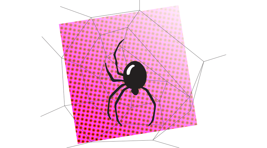
On spiders
A critical analysis of why these creatures strike horror into our hearts.
Read more >
An homage to geometric sans signage
These typefaces became the embodiment of the Modern era.
Read more >
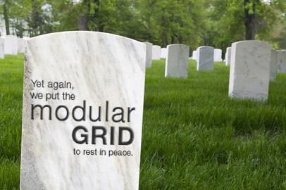
The centered text takeover
A hopeful eulogy for the modular grid.
Read more >

Copyright and Imagery
Know the origin of those images, and know the licensing agreements therein.
Read more >
Rebecca Rule Kilimnik | © 2017 | kilimnik.com