Web design has come a long way since the last century.
For instance, most people (old-schoolers like myself excluded) tend to write "web" instead of "Web." We now design sites to automatically and beautifully resize on any size device. We are concerned with accessibility—our code should be structured such that screen readers can interpret our content accurately and online videos have written transcripts. Someone finally realized human factors should be considered in Web design, so now we have considerable manpower devoted to usability and function. Oh, and CSS. Don’t let me forget that glorious invention, which has transformed and smoothed out all of the above.
All these lovely things abound, two decades after I coded my first Web site. What could I possibly miss from those naïve, early years of Web "design?"
Not much, but there are a few things that do make me a bit nostalgic.
1. It wasn’t hard to be a Web design rock star in 1996
Let’s face it, no one knew what the hell was going on with Web design (despite what we thought we knew). And, because there were no rules, the possibilities were endless. Which is why we had so many terrible things happen with Web sites in the early days of yore.
Don’t remember the badness? Let me recap:
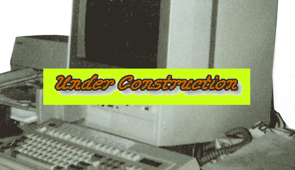
- Frames. Hell, even my mother says "Friends don’t let friends use frames." Don’t know what a frameset DOCTYPE is? Consider yourself lucky: a small part of you will forever remain unscathed.
- Ridiculous repeating background graphics. Even better if that repeating background image was an animated GIF. See Yale’s School of Art Web site for examples. And, not to knock Yale or anything. I get that they’re being cute and satirical (I happen to love this site because I like the joke), but every semester I taught Web design I had a student who would reference Yale’s site when tasked with "find the worst-designed Web site ever."
- Splash pages. Yeah, yeah, I understand that sometimes the "landing pages" of today are often referred to splash pages. And often they serve a purpose, depending on the product or content. I'm not talking about those. The nineties were rife with rather useless splash pages, sometimes with an annoying 12-minute video, that comes up when you first go to a site, and you have to either sit through it or find your way out of it before you can actually get to the content. It’s a great way to fend off repeat visitors.
- Vibrating text. Red text on a turquoise background! What a great idea! Bonus points if the text is in Comic Sans.
Are you completely engrossed in the golden glow of memory lane yet? Awesome. But remember, when most of the sites out there were fraught with pixelated Flash animations and side navigations, it was much easier to create something that looked beautiful. Even if you used tables for all of your layout! With default cellborders to boot! OMG it was the undiscovered country of lovely possibilities.
The WWW was virgin territory, with no rules and endless opportunity. All it took to set yourself apart from the rest was trying something new—and there was a lot of new for the taking.
2. You had your pick of domain names
Are you kicking yourself for not registering that two-letter or three-letter acronym dot com back when you still could? How about nabbing yourname.com or something quite popular, like ask.com or websites.com? Why didn’t you buy it when it was still available/affordable? Why is the sky blue? Why do people set type in Papyrus? (Ok, one of these questions actually has a logical answer.)
3. One screen-size to rule them all
In the nineties, few people had laptops, and there were no smart-phones or tablets. You made your site 800px wide and had your above-the-fold stuff at 600px high (because common theory stated that nobody scrolled). End of story. You put your navigation on the side (maybe in a frame) and had several paragraphs of copy on the front page (once you did away with that splash page). Because that was how a flyer was designed, and a Web page was just a flyer stuck on the computer screen, right?
4. More content, less sparkle
Smaller screen sizes, and the need to accommodate them, contain the inherent problem of not being able to display all the information in one place. Plus navigation is a constant challenge. There have been some creative solutions to all of these things on many different sites, but Tufte’s voice in my head wants all information to be in one place at one time, allowing me to decide how I want to explore the information, and Krug’s pioneering usability wisdom tells me that information should be in the same place on all sites on all screen widths. And we all know that neither of these perfectly valid information design practices are at all practical or possible on most mobile platforms.
But I’m an old-fashioned Gen-Xer who wants my mobile experience to be the same as my computer screen experience. I want to review an example site on my desktop and then show it to a client on my iPad—and know where everything is. I don’t want the mobile site to decide how I should approach the information—I want the ability to choose how I move through the information. And I certainly don’t want my mobile content to be truncated. Yes, the devices are different, but I want the information, and how I find it, to be the same. (UX designers out there don’t go hating on me for saying this.)
But, when designers do try to keep mobile and desktop sites the same, they end up with vastly simplified sites, even at the larger screen sizes. Which are wonderful in some cases and awful in others.
So, while I jest when I say I miss the strict 800px x 600px screen size design of previous decades, I do think we have a long way to go in mastering responsive design. And, when it’s finally hammered out into an exact science, we'll have moved onto something else and it will be as obsolete a skill as knowing Macromedia Director.
Article directory:
3 Simple Ways to Edit PDFs
Take charge of your files without having to bother your designer
Read more >
4 Common Mistakes When Using Line in Design
Lines have meaning. Use them correctly or look like a buffoon.
Watch Video >

5 Quick Tips for Using the Pen Tool
Nobody likes the pen tool on the first ten tries. These tips will make using it less painful.
Watch Video >

Your own POPs and PODs
Create your personal design brand using marketing principles.
Read more >

What I tell students when they say they want to freelance
Spoiler Alert: I usually try to talk them out of it.
Read more >
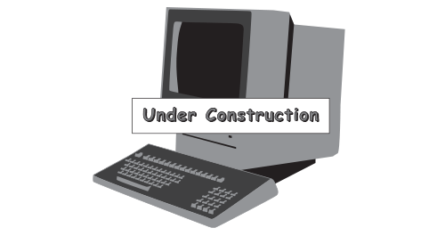
What I miss about Web design of the '90s
Web design has come a long way since the last century, for better or for worse.
Read more >
Semiotics in typography
There is a reason the shape of a serif makes you feel that way.
Read more >
An introduction to Gestalt principles
Know what it's really all about.
Read more >

To barter or not to barter
Here are some general guidelines to follow to ensure relationships emerge unscathed.
Read more >

On spiders
A critical analysis of why these creatures strike horror into our hearts.
Read more >
An homage to geometric sans signage
These typefaces became the embodiment of the Modern era.
Read more >

The centered text takeover
A hopeful eulogy for the modular grid.
Read more >

Copyright and Imagery
Know the origin of those images, and know the licensing agreements therein.
Read more >
Rebecca Rule Kilimnik | © 2017 | kilimnik.com