It's difficult to discuss design fundamentals without the words "Gestalt theory" popping up. Gestalt, when applied to art and design, refers to the overarching aesthetics of a design as a whole; the entire composition should be cohesive visually. Individual characteristics of a design should be carefully considered, but it is the connections between these characteristics (individually and holistically) that make the design successful.
Rudolf Arnheim and Gestalt Theory
Rudolf Arnheim (July 15, 1904 – June 9, 2007) is usually associated with the more cerebral texts he has written, such as Visual Thinking. He is one of the first individuals to apply psychological theory to artistic practice. It is from him that the term "Gestalt" first derived a direct application to design principles.
Gestalt theory in design states there are six principles that need to be considered in creating an effective design. Those principles are Similarity, Continuity (sometimes called "Common Fate"), Closure, Proximity, Figure/Ground (sometimes referred to as White Space) and Symmetry.
Similarity.
Elements of a design that have common features tend to be grouped as belonging to one another, or as being on the same "level" of a design hierarchy. For instance, take a look at this page on Swatch's site below:
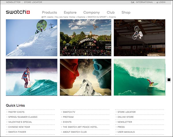
www.swatch.com/zz_en/sportevents.html
This site is beautiful in its simplicity. Notice how the photos in the main space of the page are of all different subjects, but they all flow nicely together thanks to the principle of similarity. The designer has sized all the images exactly the same, presented them in bold color (no black and white or sepia images are here), and applied the same hover effect (red overlay with white sans serif text) on each.
If you look below the images, you see the Quick Links section also has the similarity principle applied--everything is spaced the same, same color, same font. You can quickly tell that the Quick Links belong to one another, are separate from the imagery, and are also separate from the links above.
Similarity is usually grouped under the overarching principle of unity, which is not technically a Gestalt principle, but which is a common design principle you'll probably encounter in other resources.
When something is made dissimilar on purpose, it is usually to create contrast and/or emphasis.
Continuity.
This is sometimes referred to as flow, or movement, or "common fate." The idea behind continuation is that your eye moves across the page according to cues that you have set into your design. Elements that flow together are perceived as harmoniously belonging to the same group. If you have a portion of your design that changes direction or moves against the flow of the rest of the design, you will create visual tension. Sometimes this is a good thing—it can create the emphasis that is so important in your design's hierarchy. However, if a break in continuation is unintentional, it can make your design look jarring and uncomfortable.
Closure.
This is Gestalt theory at its finest, and pure psychology of perception to boot. Our brains are designed to find patterns and meaning behind random shapes. It's how we can spot a leopard hiding behind tall grass; it's also why we so easily think clouds look like certain objects, and why we see the man in the moon. So, therefore, it makes sense that if we present only part of an object, our brains work to try to "close off" the edges of that object and see it as a whole.
Aside from interesting logos and fun illustration projects, this principle is important in creating shapes in your design. You do not need to actually draw a square in order to show a square in your design. You can simply set justified type within a square text box and achieve the illusion of a square.
Proximity.
This one is important (well, they're all important, but this one is really important). Consider the site by Google below:
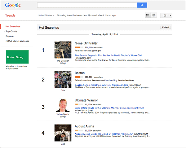
www.google.com/trends/hottrends
This looks like a very long list of information. Yet the site designer has done a remarkable job of keeping a photo, headline, tagline, rank, number of searches, etc, all grouped together with each trend. How? Proximity. The elements that belong together are closer to each other, and there is a healthy amount of white space between them.
Notice that this page is also a great example of similarity.
Figure/Ground.
Or positive/negative space. Or white space. Or foreground/background. This term has a lot of synonyms. But what does it mean?
Many discussions of figure/ground treat this concept as if it were used strictly for optical illusions. Kind of like closure. However, the use for this principle goes much deeper than that. The most important takeaway from the concept of figure/ground is that negative space is just as important as positive space. Even if that negative space is not meant to look like some hidden image, negative space still creates a shape.
One of the reasons the font Helvetica is considered so beautiful is because the space inside and between the letters is just as balanced as the space that the letters occupy. The positive space is equal in importance as the negative space, and this balance creates an aesthetic sense of calm. Designers always have to consider not just what is on the page, but where emptiness exists on the page. As your own design, try to think of the white space on a page as being just as tangible, real, and deliberate as the space occupied by letters and images.
Symmetry.
This term can be a little confusing, because a lot of design texts talk about symmetrical and asymmetrical balance. If it helps, think of symmetry as balance instead; you can have a perfectly balanced design that is also asymmetrical.
From a Gestalt standpoint, what symmetry means is the left side of the page has just as much "weight" as the right side. You can have one large, bold word on the left hand side and a large block of tiny, regular type on the right, and it will still have balance.
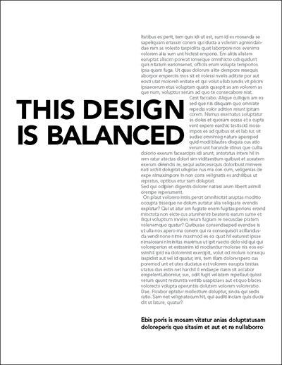
While the above design is technically asymmetrical, it achieves balance because each side feels like it has the same "weight." The left side has big bold words, but they occupy less space than the large gray block to the right. Furthermore, the boldness near the top of the page is counter-weighted with the bolder words toward the bottom. Overall, a sense of symmetry is achieved through an asymmetrical design.
Taken from my personal lecture materials.
Article directory:
3 Simple Ways to Edit PDFs
Take charge of your files without having to bother your designer
Read more >
4 Common Mistakes When Using Line in Design
Lines have meaning. Use them correctly or look like a buffoon.
Watch Video >
5 Quick Tips for Using the Pen Tool
Nobody likes the pen tool on the first ten tries. These tips will make using it less painful.
Watch Video >
Your own POPs and PODs
Create your personal design brand using marketing principles.
Read more >
What I tell students when they say they want to freelance
Spoiler Alert: I usually try to talk them out of it.
Read more >
What I miss about Web design of the '90s
Web design has come a long way since the last century, for better or for worse.
Read more >
Semiotics in typography
There is a reason the shape of a serif makes you feel that way.
Read more >
An introduction to Gestalt principles
Know what it's really all about.
Read more >
To barter or not to barter
Here are some general guidelines to follow to ensure relationships emerge unscathed.
Read more >
On spiders
A critical analysis of why these creatures strike horror into our hearts.
Read more >
An homage to geometric sans signage
These typefaces became the embodiment of the Modern era.
Read more >
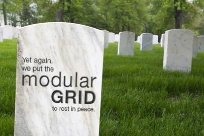
The centered text takeover
A hopeful eulogy for the modular grid.
Read more >
Copyright and Imagery
Know the origin of those images, and know the licensing agreements therein.
Read more >
Rebecca Rule Kilimnik | © 2017 | kilimnik.com