Semiotics, in short, is the study of signs and symbols. When we talk about semiotics in type, we're focusing on the symbolism behind different typefaces and type categories.
If you've done any typographic study, you already know that there is a lot going on within each individual serif, counter, and stem in a typeface. Everything—proportions, curves, color—has been considered when creating each letter in a well-designed typeface. And those little bitty details all carry meaning. Thanks to its rich history as an artform, typography itself can harness strong semiotic associations that can either hinder or enhance your design.
Associations by typeface category
Blackletter
Prior to Gutenberg's printing press, everything in Europe was written by hand. Parchment was expensive and each manuscript was a laborious creation rife with errors. By the beginning of the 15th century, formal handwriting had become as horizontally condensed as possible to allow for more words per page. This "gothic" or "blackletter" script was nearly ubiquitous throughout Europe until the Renaissance brought about a revival of handwriting associated with classical antiquity.
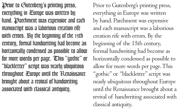
The two above blocks of text are the same width, but you can easily see how the gothic type on the left is more space efficient.
While the alphabet was beginning to change into something more recognizable to us in other parts of Europe (see below), it remained as blackletter in Germany. In fact, it began to take on a German nationalist identity—an identity that resurfaced prior to WWII.
When to use blackletter fonts
Blackletter has some very interesting symbolism attached to it. It was the "look" for Medieval bibles and church manuscripts, so it certainly holds associations with the Middle Ages and the Church. However, due to its enthusiastic adoption by Nazi Germany, it has also gained associations with evil. If you are tasked with creating a movie poster for a Roman Polanski devil movie, this would be your typeface of choice.
Humanist type
The first non-blackletter moveable type in Europe is traditionally referred to as Humanist, and it first showed up in the middle of the 15th century, shortly after Gutenberg invented his press.
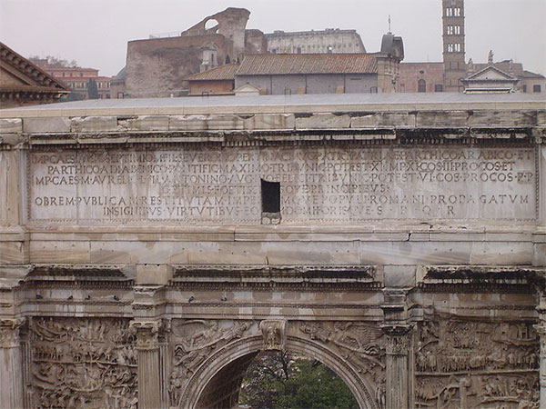
While printers in Germany were trying to mimic blackletter handwriting, the Renaissance had taken full hold of printing in Italy. Here, the alphabet was going through a shift; in attempts to revive the classic shapes of ancient Roman letterforms, Renaissance writers appropriated the letters carved into Roman monuments. (This, by the way, is why these classic serif faces are referred to as "Romans.") The Romans only used uppercase letters, however, and by this point our alphabet had evolved to the point that we had lowercase letters as well. Renaissance handwriting, therefore, took inspiration from Carolingian miniscule for its lowercase letters (in vogue during and after the reign of King Charlemagne), and put them with the Roman uppers for a beautiful new alphabet.
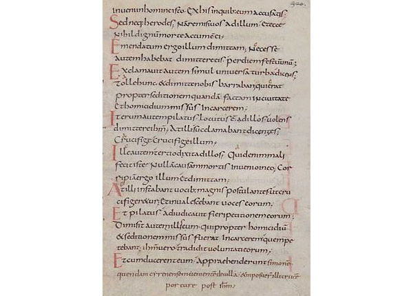
Just about the time that the Italian Renaissance changed handwriting, printing came to Italy. The new "humanist" handwriting became appropriated into moveable type.
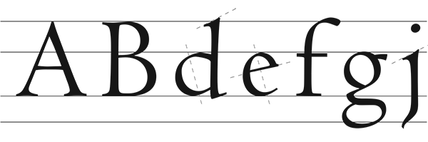
Humanist Roman faces are identified by the following tenets:
- slanted stroke axis
- slanted bar on lower-case e, perpendicular to the stroke axis
- slanted ascenders and foot serifs on lower-case
- capitals same height as ascenders
- moderate contrast between thicks and thins
- steeply sloped and heavy serifs
- letters wide-set (large aperture)
- heavy weight and color
- small x-height
When to use a Humanist typeface
When you use a typeface that looks like this, you are evoking the classics. Use a slanted stroke serif when you want to make your composition look elegant, traditional, or neoclassical. Humanist fonts can sometimes have an unintended rusticism to them as well, due to the slanted axes and heavy color.
Examples of Humanist typefaces include Centaur and Adobe Jenson.
Old Style Roman
Old Style faces came into vogue quickly after the Humanist faces—by the end of the 15th century, everyone was using them. Well, everyone but the Germans. These typefaces remained so popular that they were in vogue clear into the mid-1700s.
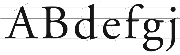
Old Style Romans are identified by the following tenets:
- horizontal bar on lower-case e
- slanted ascenders and foot serifs on lower-case
- slanted axis
- capitals generally shorter than ascenders
- greater contrast between thicks and thins
- bracketed serifs, much lighter than humanist
- smaller aperture than humanist
- medium weight and color
- head serifs become sharp wedges
- greater x-height
When to use an Old Style Roman typeface
One of the most widely used Old Style typefaces of its time was Caslon, invented by William Caslon I around 1720. If England had a national typeface at this time, it was Caslon. Almost everything in England and the American colonies was printed in it. In fact, even the Declaration of Independence was set in Caslon.
It goes without saying that you would use an Old Style face if you wanted to evoke the Baroque or Neoclassicist periods. But its history brings in even more associations. Use an Old Style, particularly Caslon, if you want to create something patriotic, classic, and gently authoritative.
In addition to Caslon, common Old Style faces are Bembo, Garamond, Goudy, Janson Text, and Sabon.
Transitional
To our eyes, there may not seem to be much difference between Old Style and Transitional faces. At the time of their invention, however, transitionals looked shockingly revolutionary. (They were in vogue in the middle of the 18th century.) These new fonts completely eschewed all references to handwriting. They were mechanical, geometric, and a complete embodiment of the Enlightenment period that produced them. Roman du Rois, created at the commission of the king of France in 1698, was the first typeface where each letterform was designed on a grid. Baskerville, invented by John Baskerville, soon came to enjoy intense popularity in England and the Americas. Benjamin Franklin, a personal friend to John Baskerville, was a huge fan.
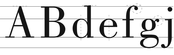
Tenets of Transitional faces:
- slanted ascenders and foot serifs on lower-case
- nearly vertical or completely vertical axis
- serifs of ascenders slightly slanted
- horizontal foot serifs
- medium to high contrast between thicks and thins
- bracketed and sharp serifs
- smaller aperture
When to use a Transitional typeface
If you want your design to look mechanical, but still elegant, then transitional faces are the way to go. They may have less personality than their forefathers, but they fill an important need: they are unoffensive and effective, while still conveying a sense of class.
Modern Roman
Modern Roman faces (and that's Modern with a capital "M") are an example of serifs pushed to the extreme. These faces first appeared with the invention of Didot in 1784, and were the result of type designers pushing the very envelope of type cuting technologies. They exemplify form over function, a common theme in late 18th century Europe. Extreme differences in thicks and thins made for difficult legibility, and today these Modern faces are rarely used for small print.
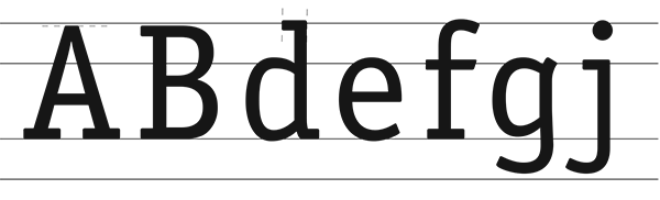
Tenets of Modern Roman faces
- horizontal ascenders and foot serifs on
- lower-case
- vertical axis
- huge contrast between thicks and thins
- very fine, horizontal serifs
- small aperture (in most cases)
- terminals rounded
When to use a Modern Roman
Today Moderns are associated most closely with the fashion world. The Vogue Magazine masthead is in a Modern roman, as is the Coach logo. Commonly used Modern faces are Didot and Bodoni.
Slab serif
The Industrial Age of the 19th century brought technological advances in printing, which, in turn, led to the ability to produce cheap, mass market advertising. Typefaces were created to to be bold, to be different, to grab attention. It was during this time that the slab serifs emerged.
Thanks in large part to Napoleon's campaign to Egypt in the early 19th century, Europe saw an interesting phenomenon known as Egyptomania--a popular obsessions with all things related to ancient Egypt. Capitalizing on this phenomenon, many slab serif type designers of the time gave their new creations names such as "Cairo," "Karnak" and "Antique."
Tenets of Slab Serifs
- barely visible contrast between thickness in stroke
- larger aperture
- serifs same thickness as the stem
- unbracketed square serifs (with the exception of Clarendon)
- lower-case “g” is often single story
- generally a larger x-height
- generally wide aperture
When to use slab serifs
Slab serifs have strong associations with the 19th century, and with that comes an association with the Old West. Use slab serifs any time you want to convey a sense of ruggedness. This idea is apparent in "rugged" logos such as those of Marlboro, Arby's, and Wells Fargo.
Some slab serifs you'll likely encounter include Clarendon, Cushing, and Rockwell. Typewriter fonts such as ITC American Typewriter and Courier are also slab serifs.
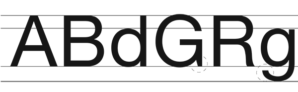
Sans Serif Grotesque
The first sans serifs, also emerging in the early 19th century, were known as "grotesques," as they were initially received as disturbing and unseemly. (Sometimes you'll see this written as grotesk--some designers argue there is a difference between grotesk and grotesque, but for the purposes of this article we'll asume they are the same.) By definition, sans serif means "without serifs."
Tenets of sans serif grotesques:
- some (though not much) contrast between thicks and thins
- slight squareness to the curves
- no serifs whatsoever
- curled leg in capital “R”
- open-tailed “g”
- spur on capital “G”
- large x-height
- smaller aperture (sometimes)
When to use grotesques
Grotesques, and their 20th century counterparts, neo-grotesques, are intended to be so void of emotion and symbolism that they create a symbolism all their own. Use grotesques and neo-grotesques when you want something to be clear, emotionless, corporate, and/or informational. They have strong associations with the International Style, and the time periods associated therewith; anything meant to evoke the concepts of the Cold War, Nuclear families, or big corporations would do well to use grotesques and neo-grotesques. Examples of fonts in these categories include Akzidenz Grotesk, Franklin Gothic, Helvetica, Helvetica Neue, Trade Gothic, and Univers.
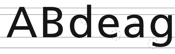
Sans Serif Humanist
There are quite a few sans serif categories that we could go through, but we'll only be covering two more here. Sans serif humanist (first appearing early 20th century) is called such because its form is more remniscent of handwriting than other sans serif fonts. This aspect is noticeable in subtle variations between thicks and thins in the letterforms. As a result of this less formal structure, these fonts can't help but have more personality than their grotesque counterparts.
Tenets of sans serif humanist:
- proportions based on humanist roman typefaces
- some contrast between thickness in stroke
- no serifs whatsoever
- lower-case “g” is often double-story
- lower-case “a” is often double-story
- thickened finials
- larger x-height
When to use a sans serif humanist
Sans serif humanists are appropriate when your content deserves a friendlier, more personable approach. Sans serif humanists are excellent for children's textbooks, as well as ads and articles that want to feel approachable. These fonts also have a history with transportation: Edward Johnston's London Underground Sans, Eric Gill's Gill Sans, and fonts that look very much like both of them, have been used by the British Rail and SEPTA for signage and printed materials.
In addition to Gill Sans, commonly seen sans serif humanists include Frutiger, Trebuchet, Calibri, and Verdana.
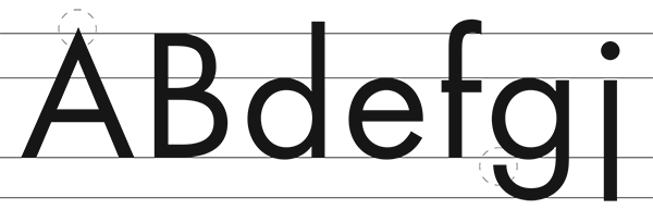
Sans Serif Geometrics
We conclude our look at sans serifs by discussing the geometrics. These types first became popular in the 1920s, when much design was concerned with rationalizing concepts through geometric shapes and abstract forms. A geometric is easily recognizable as it looks as though the letterforms are based on perfect circles, squares, and triangles.
Tenets of sans serif geometric:
- proportions based on circles and rectangles
- usually no contrast between thickness in stroke
- no serifs whatsoever
- lower-case “a” is often single-story
- wide aperture
- smaller x-height
- pointed apex on “A”, “W”
When to use a geometric sans serif
Even though there is a strong geometric base to these fonts, they do not have the same regimented, corporate symbolism of a grotesque or neo-grotesque. Rather, these fonts have strong associations with the myriad avant garde movements of the 1920s, giving them a progressive, innovative feel. These fonts work well for art brochures, alternative energy materials, or anything trying to feel fresh yet grounded, youthful yet knowledgeable.
Futura is the quintessential geometric; it was Paul Renner's most lasting achievement and still appears as fresh and unburdened as it did 80 years ago. Other sans serif geometrics you'll likely encounter include Century Gothic, Avenir (my personal favorite), Gotham, and ITC Avant Garde.
Article directory:
3 Simple Ways to Edit PDFs
Take charge of your files without having to bother your designer
Read more >
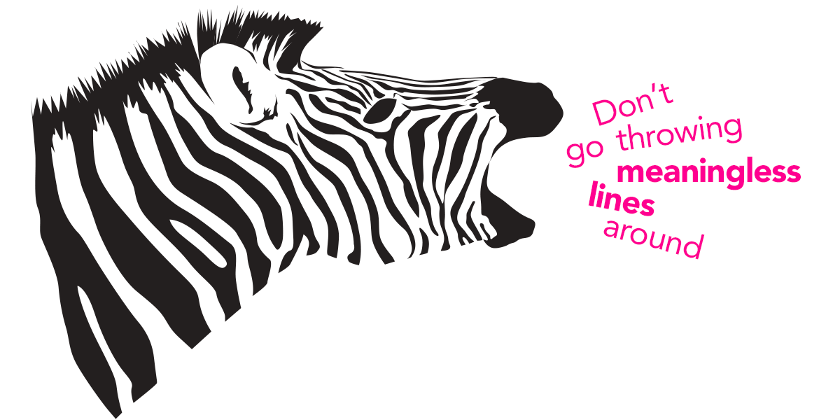
4 Common Mistakes When Using Line in Design
Lines have meaning. Use them correctly or look like a buffoon.
Watch Video >
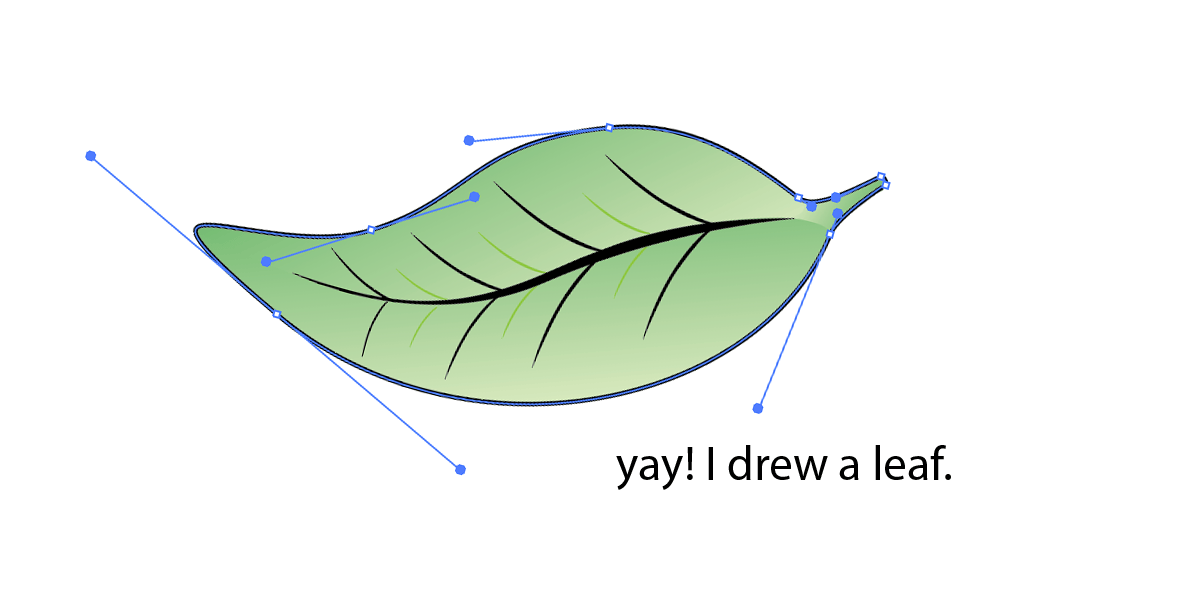
5 Quick Tips for Using the Pen Tool
Nobody likes the pen tool on the first ten tries. These tips will make using it less painful.
Watch Video >

Your own POPs and PODs
Create your personal design brand using marketing principles.
Read more >

What I tell students when they say they want to freelance
Spoiler Alert: I usually try to talk them out of it.
Read more >

What I miss about Web design of the '90s
Web design has come a long way since the last century, for better or for worse.
Read more >
Semiotics in typography
There is a reason the shape of a serif makes you feel that way.
Read more >
An introduction to Gestalt principles
Know what it's really all about.
Read more >
To barter or not to barter
Here are some general guidelines to follow to ensure relationships emerge unscathed.
Read more >

On spiders
A critical analysis of why these creatures strike horror into our hearts.
Read more >
An homage to geometric sans signage
These typefaces became the embodiment of the Modern era.
Read more >
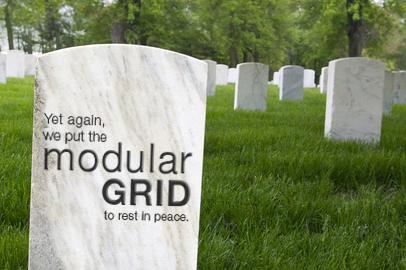
The centered text takeover
A hopeful eulogy for the modular grid.
Read more >
Copyright and Imagery
Know the origin of those images, and know the licensing agreements therein.
Read more >
Rebecca Rule Kilimnik | © 2017 | kilimnik.com