The other day, my family visited the Tellus Museum in Cartersville, GA. I noted with interest that all exterior stone signage was set in a geometric sans serif face.
I often teach that geometric sans serif faces are best suited for "anything trying to feel fresh yet grounded, youthful yet knowledgeable." (See my article on semiotic typography.) And by that logic, using this type of typeface for museum signage is quite appropriate. Still, I felt like there was something of a disconnect between a geometric sans serif, and a science museum. So I set out to explore why.
Geometric sans serif faces became the embodiment of the modern era in the 1920s, when The New Typography, the Bauhaus school, and others sharing in its philosophy sought to create the perfect font for the machine. In other words, designers following this philosophy embraced the orderliness and impersonal nature of an era driven by mechanical invention.
One of the key notions of this philosophy was that of the artist as engineer. According to Robin Kinross1, the real underlying principle behind this notion was not necessarily of impersonalization of art, but rather the desire to create a set of hard and true standards that could be applied to paper sizes, type conventions, and even to letterforms themselves. These standards, by their very nature, acknowledged the qualities of the machine, as opposed to previous non-standardized approaches to print design, where every page required the touch and reorganization by an actual human being.
It seems logical, then, that a universal, standardized font would rely on perfect circles, isosceles and equilateral triangles, and perfect squares as the basis for its construction. Such perfect shapes are standard in nature, so would they not also be standard in machine-produced typography? And so, typographers from this era labored to create such a font, using circles for "o" and triangles for "A" (where capital letters were allowed by that typographer's personal philosophy).
Nearly everyone, not just students of design, are either consciously or unconsciously familiar with one of the most famous fonts to have come from this movement. Futura, designed by Paul Renner, is a splendid geometric sans that somehow manages to appear geometric without experiencing the clunkiness that other, truer geometrics possess. I'm not completely sure that the font on the Tellus' signage was Futura, but it was certainly just as beautiful.
So, if a geometric sans serif embodies the Modern era, embraces the idea of designer as engineer, and captures the enthusiasm of society in the midst of scientific advancements, it would reason that this typeface style would be absolutely perfect for the signage at a science museum. And, indeed, it is.
Except for one, small point.
We no longer live in the Modern era.
We are post-modernists, whether we embrace postmodernism or not as a movement. Now, I am not an expert in postmodernism. I am, admittedly, a Modernist in my own design approach. However, I concede that that in itself makes me a postmodernist. While Modernism is, by its very nature, forward-looking, postmodernism looks to the past for inspiration. So, a Modernist living in the postmodern era is, by definition, postmodernist.
By that argument, the use of a geometric sans in a scientific context is actually referencing a bygone time; a golden era of scientific discovery that we can only look upon with reverence and nostalgia.
Indeed, according to the great Robert Bringhurst2, newer geometric fonts can't help but be historicist in nature, capturing the fervor and mechanical achievement of the day in a way that cannot help but drip with historical symbolism. A classic example of Bringhurst's words ringing true is the widely popular Neutraface by House Industries.
And yet, even with this argument, perhaps the signage at the museum is completely appropriate.
For one, I can't think of a type style that would be more appropriate than a geometric sans. Surely, the museum would not want the ever-trendy anti-machinist "handwritten" fonts that are so popular today, no matter how forward-looking they would want to appear. Nor would it want to set its type in the severely neutral Swiss embodiment of a Grotesk (I'm talking about you, Helvetica). Typefaces meant, by their very nature, to be emotionless are hardly the key to evoking scientific excitement.
Furthermore, the bulk of the exhibits of a scientific museum would be historicist in nature. At this particular museum, exhibits focus on geology, paleontology, and the history of motorized locomotion. All fascinating, all rooted in the past. Of course, there are always films, sidenotes, and special exhibits that discuss almost contemporary achievements and discoveries, but even these suffer from the time it takes to construct the exhibit; nothing built of metal and glass can truly discuss the exact present. And even these special exhibits are only a small portion of what the museum has on display.
So, while historicist in nature, the typeface on the museum's signage is vastly appropriate. I concluded that the disconnect I felt came from a sadness that enthusiasm for scientific achievement had to be found in a modernist font, as opposed to a recent, postmodernist one. As we rounded the last turn to exit the museum, I tried to put my thoughts together, wondering if I could convey all of what I've just written to my husband, an engineer.
Before I could utter a word, he looked at the words on a stone sign, etched in perfect, geometric harmony, and said "you'd think they could find a more interesting font than Helvetica."
C'est la vie. So much for typographic symbolism transcending historical knowledge.
1Kinross, R. (2004). Modern typography (2nd ed.). London: Hyphen Press.
Repurposed from an article I originally published in 2015.
Article directory:
3 Simple Ways to Edit PDFs
Take charge of your files without having to bother your designer
Read more >
4 Common Mistakes When Using Line in Design
Lines have meaning. Use them correctly or look like a buffoon.
Watch Video >
5 Quick Tips for Using the Pen Tool
Nobody likes the pen tool on the first ten tries. These tips will make using it less painful.
Watch Video >
Your own POPs and PODs
Create your personal design brand using marketing principles.
Read more >
What I tell students when they say they want to freelance
Spoiler Alert: I usually try to talk them out of it.
Read more >
What I miss about Web design of the '90s
Web design has come a long way since the last century, for better or for worse.
Read more >
Semiotics in typography
There is a reason the shape of a serif makes you feel that way.
Read more >
An introduction to Gestalt principles
Know what it's really all about.
Read more >

To barter or not to barter
Here are some general guidelines to follow to ensure relationships emerge unscathed.
Read more >
On spiders
A critical analysis of why these creatures strike horror into our hearts.
Read more >
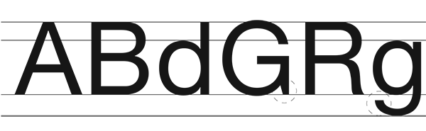
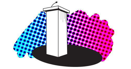
An homage to geometric sans signage
These typefaces became the embodiment of the Modern era.
Read more >
The centered text takeover
A hopeful eulogy for the modular grid.
Read more >
Copyright and Imagery
Know the origin of those images, and know the licensing agreements therein.
Read more >
Rebecca Rule Kilimnik | © 2017 | kilimnik.com