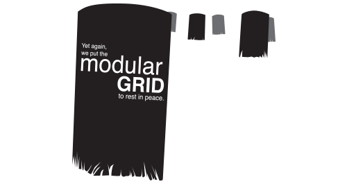
Jan Tschichold might be turning in his grave, as centered text is making a Victorian-sized comeback in modern Web design.
Okay, perhaps that is a bit harsh. After all, Tschichold, the father of The New Typography, did indeed change is tune later in life, notably apparent in the creation of his serif face Sabon and his template for Penguin Books covers.
As Tschichold slowly pulled away from the limits of left-aligned modular-grid bound text, so, too, is the Web unveiling a new design trend based on the need for fluid, responsive design, an aging population and font limitations.
Personally, as a print designer heavily trained in the old-school ways of the early 21st century, I find the abundance of centered text absolutely fascinating. A new generation of design that has never been forced to consider the location of the spine or expertly controlled margins has chosen absolute symmetry. Of course, just because it's now appropriate to center your h1 and h2 tags doesn't mean typography is any easier in the interactive realm; quite the opposite. Now, the designer must seek new ways to achieve beauty and sophistication without the aid of a rigid grid and absolutely defined white space. The typography must be robust enough that it can stand up to being pulled and pushed by this browser window size or that. Balance must be achieved in a variety of scenarios, and must remain clean despite the interruption of drop-down windows, interactive pop-ups and that user with the 5K retina display (I stand guilty). And somehow, that design still needs to follow user interface design principles, and convey information in a clear and concise way.
So, if centered text is the solution to these issues, I applaud it. I will no longer chide my students for resorting to its siren's call. I will resist paraphrasing my professors as they declared "centered text is for tombstones!" I will watch, observe, and maybe even center a heading or two myself.
Repurposed from an article I originally published in 2015.
Article directory:
3 Simple Ways to Edit PDFs
Take charge of your files without having to bother your designer
Read more >
4 Common Mistakes When Using Line in Design
Lines have meaning. Use them correctly or look like a buffoon.
Watch Video >
5 Quick Tips for Using the Pen Tool
Nobody likes the pen tool on the first ten tries. These tips will make using it less painful.
Watch Video >
Your own POPs and PODs
Create your personal design brand using marketing principles.
Read more >

What I tell students when they say they want to freelance
Spoiler Alert: I usually try to talk them out of it.
Read more >
What I miss about Web design of the '90s
Web design has come a long way since the last century, for better or for worse.
Read more >

Semiotics in typography
There is a reason the shape of a serif makes you feel that way.
Read more >
An introduction to Gestalt principles
Know what it's really all about.
Read more >
To barter or not to barter
Here are some general guidelines to follow to ensure relationships emerge unscathed.
Read more >
On spiders
A critical analysis of why these creatures strike horror into our hearts.
Read more >
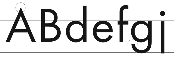
An homage to geometric sans signage
These typefaces became the embodiment of the Modern era.
Read more >
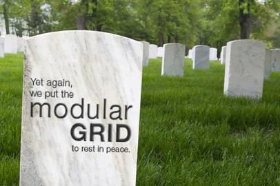
The centered text takeover
A hopeful eulogy for the modular grid.
Read more >

Copyright and Imagery
Know the origin of those images, and know the licensing agreements therein.
Read more >
